The first was based around dynamic particle animations:
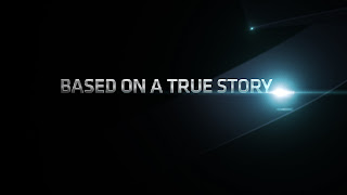
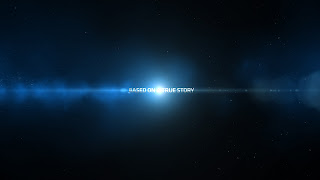
The third approach was a bit simpler, incorporating lens flares and atmospheric dust with dramatic camera moves:
The client was happy with the general feel and the type treatment but wanted the background to somehow relate to the product, a portable ultrasound, without using actual sonograms. We presented them with these styleframes, which they went with:
We had a couple of days to finish the spot which you can view on my website at www.lisedupuis.net. All images © Suspect, NYC.


